September 2024
Project brief
The project aims to challenge students to explore the depths of typographic design, encouraging innovation and a deep understanding of typographic principles. It is designed for students to master applying typographic concepts and techniques. The project is divided into three phases: research and analysis, creative design, and publication. Each student will select a significant typographic/graphic design movement or designer from history.
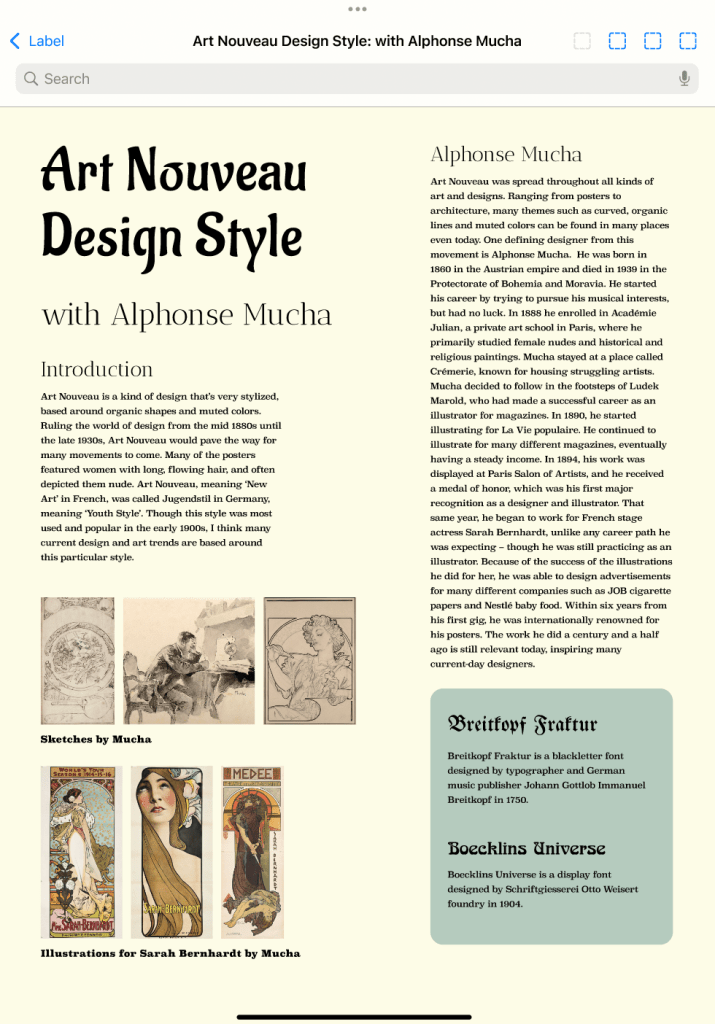
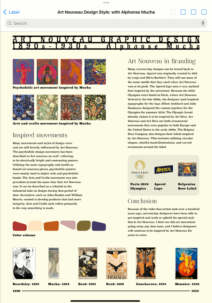
Functioning as an introduction to Information and Publishing Design Systems, which I took in the fall of my junior year, I was tasked with researching an art movement that interested me and designing a print piece that conveyed important information in written and visual form. I chose Art Nouveau for its rich visual history and inspiring aesthetic. To ensure the accuracy of my work, I conducted extensive preliminary research. I wrote a description of the movement, which deepened my understanding of its core principles and context of use. This project enabled me to highlight typographic principles that defined Art Nouveau, share key moments in graphic design history, and demonstrate the implications of modern tools on the movement. After completing the print version, I revisited the project for extra credit, redesigning it as a digital layout. This transition challenged me to explore new ways of presenting the same content, focusing on visual hierarchy and applying the design to a different medium. Through this process, I learned the importance of identifying the affordances and limitations of media and the value of versatility in design.
Below is a gallery of my project deliverables. Please read more about my process here.
After I completed the inital project, I went on to design a digital version of the same text I wrote.
I’m glad I created a digital version of my initial design, as it allowed me to explore new possibilities and adapt the layout to work uniquely compared to the print version. The digital format gave me the flexibility to experiment with potential interactive elements, dynamic visuals, and user-friendly navigation, which enhanced the overall experience and brought a fresh perspective to the design. This process not only expanded the versatility of my work but also challenged me to think beyond traditional print constraints.
If I were to revisit this project, I would establish my grid earlier in the design process to create a stronger foundation for structure and alignment. This would allow me to emphasize hierarchy more effectively in my type selection, ensuring that key information stands out and guides the viewer’s eye naturally. I would also prioritize legibility from the outset, refining my typographic choices and spacing to balance clarity with aesthetic appeal. By addressing these aspects sooner, I could create a more cohesive and polished final design.
