October 2024
Project Brief:
Create a hybrid style handbook webpage prototype centered around a logo and/or logotype from before 1984.
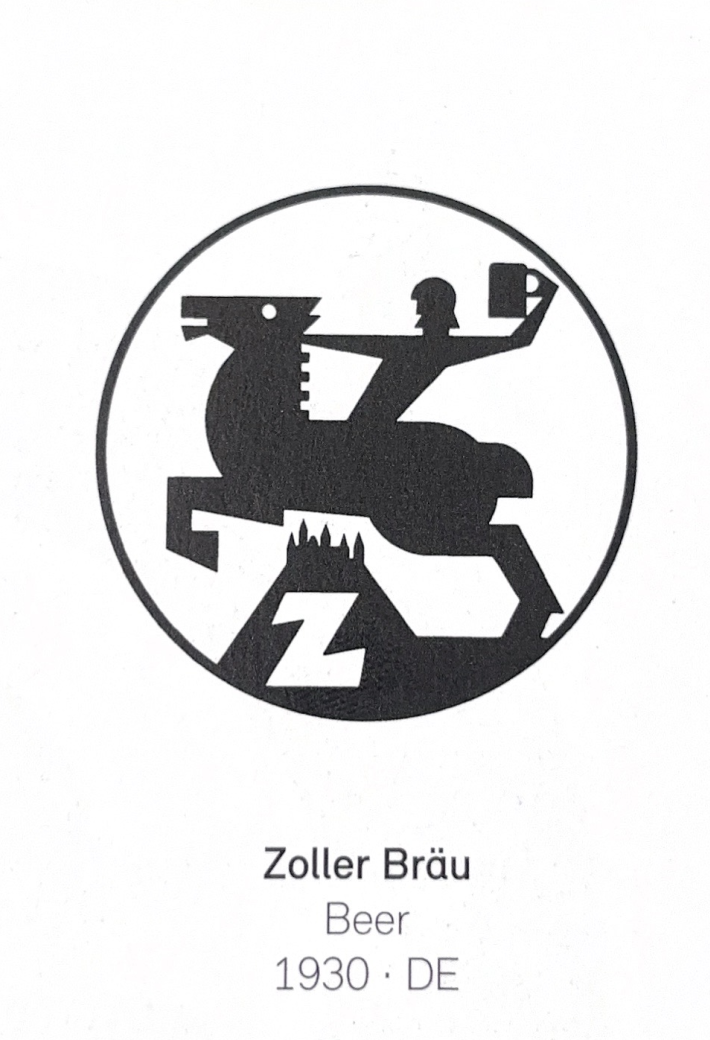
In my senior studio spring semester, I completed a branding project that focused on reviving a lost logo from a different era. Working alongside Josué Avalos, we designed a cohesive system based solely on the logo we found in a book.
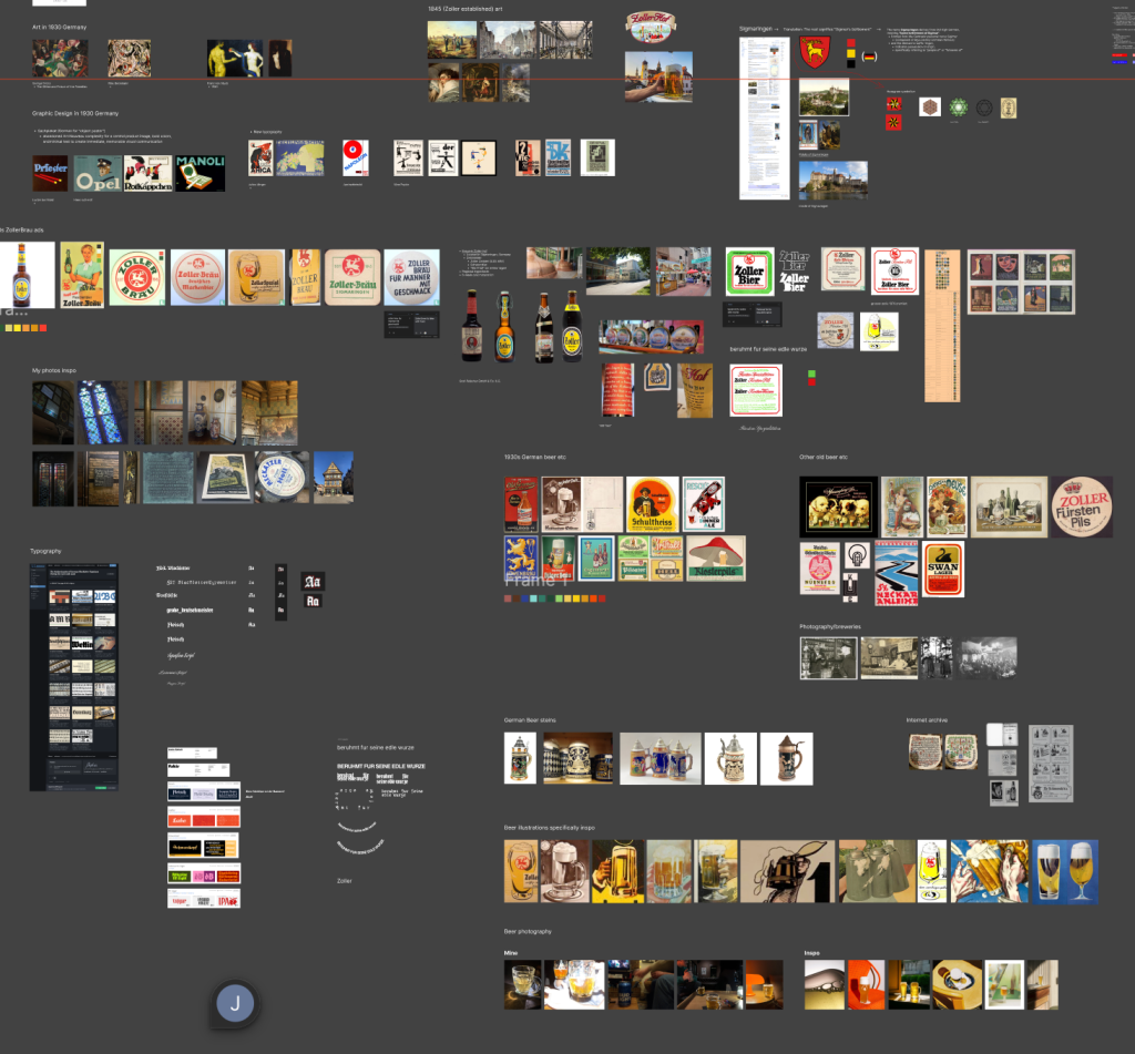
We defined how to depict an overview of our system, and what specific elements we had to design around these.
Overview
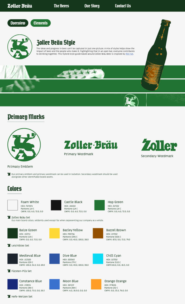
– Primary Marks
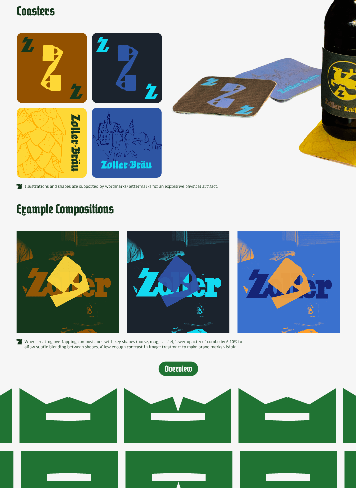
– Colors
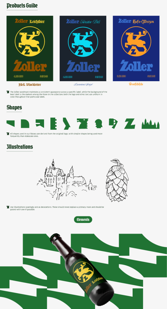
– Products Guide
– Shapes
– Illustrations
Elements
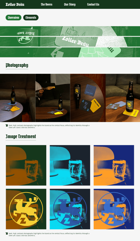
– Photography
– Image Treatment
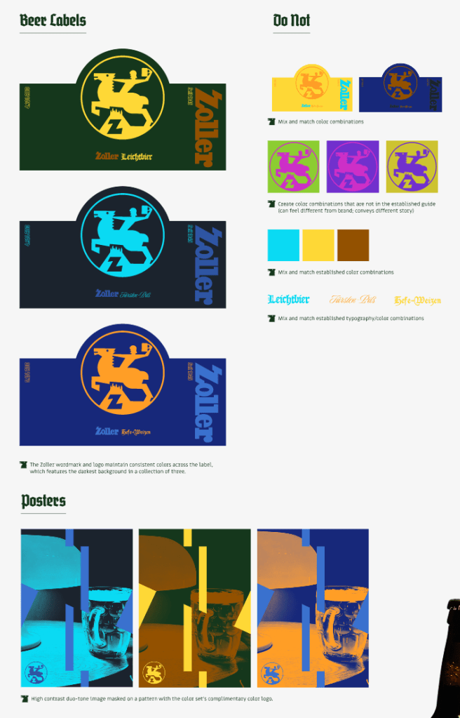
– Beer Labels
– Posters
– Example Compositions
– What not to do when designing
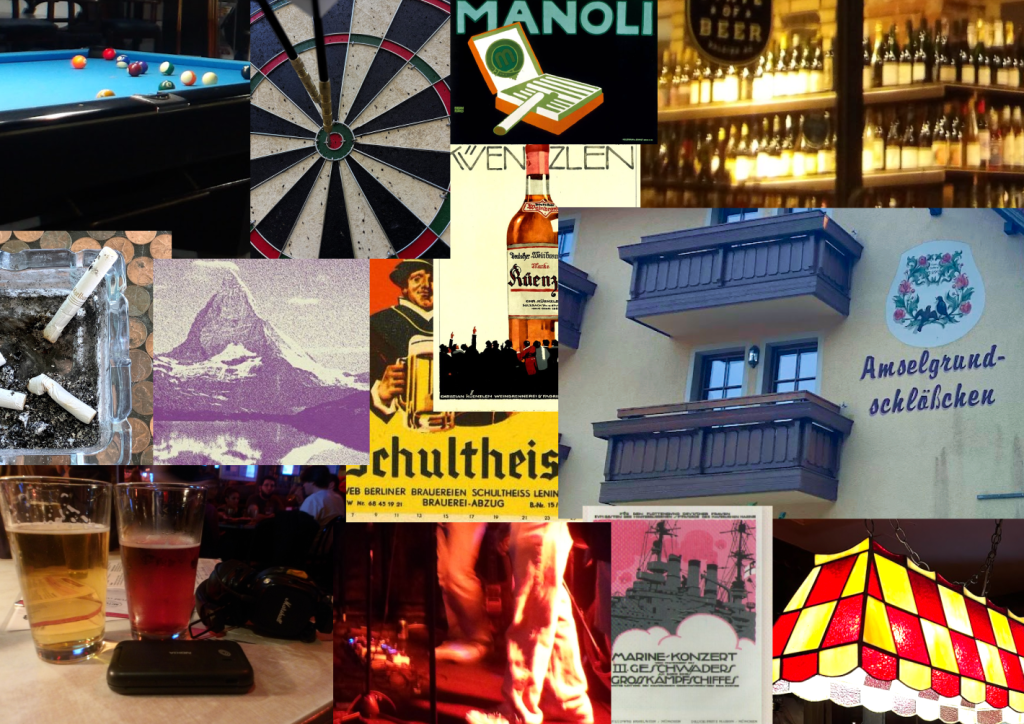
The Moodboard helped up establish a general feel to the brand, beyond how it appears digitally, but physical artifacts as well. We wanted the Zoller Bräu brand to feel classically elite while having a modern touch.
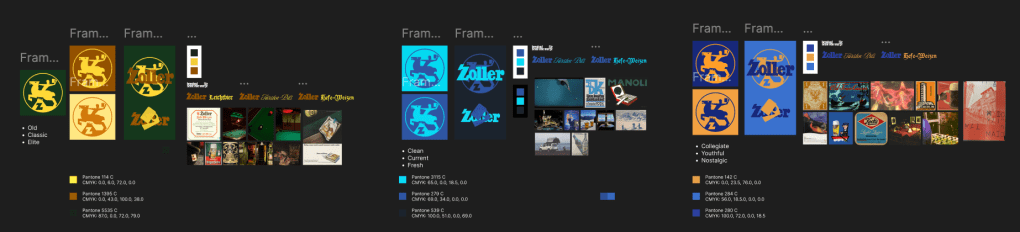
Each specific kind of beer has a recognizable color set with an associated typeface.
Designing a cohesive system around a simple logo made us think outside the box to create our own interpretation of what the brand could be. Since we found the logo in an old book and could find just a small trace of it online, it was up to us to establish.
We designed the page prototypes based on Red Hat’s Hybrid Style Handbook.
